Enhancing Brand Consistency and Efficiency with Customizable Data Visualization
Enhance brand consistency and efficiency with Event Registry’s Chart Customizations. Personalize data visualizations to align with your branding, save time with in-built tools, and boost user engagement. Discover how our feature can transform your data presentations and decision-making.

Introduction
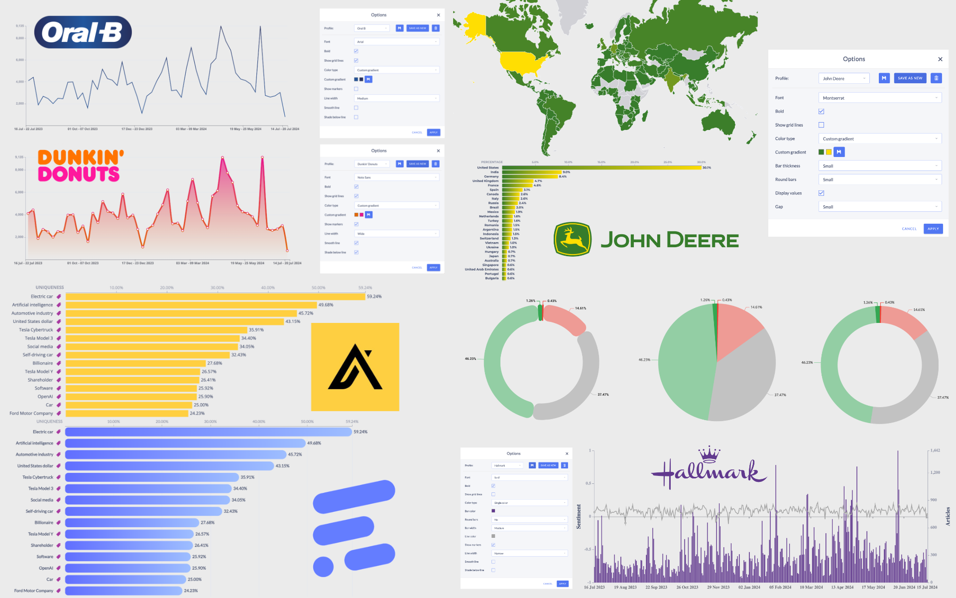
In today’s data-driven world, the ability to present information clearly and compellingly is crucial for decision-making. With the increasing reliance on data analytics, the visualization of data becomes as important as the data itself. Event Registry is proud to introduce a new feature that brings this aspect into sharp focus: Chart Customizations. This feature allows users to personalize charts by selecting colors and styles that align with their branding, and even save these preferences for future use.
Importance of Branding in Data Presentation
Branding is essential not only for marketing but also for internal and external business communications. It ensures that every piece of content reflects the company's identity, fostering a strong and consistent brand image. According to Keller and Brexendorf (2017), consistent brand presentation across all platforms, including data reports, can increase revenue by up to 23%. By enabling users to customize their data visualizations, Event Registry ensures that each chart not only conveys information but also reinforces brand identity, building trust and recognition among stakeholders.
Customization Enhances User Engagement
Personalization is a critical element of user experience. By providing users with the ability to customize their data visualizations, Event Registry caters to diverse preferences and enhances user engagement. As Norman (2004) points out, attractive things work better. When tools are enjoyable to use and aesthetically pleasing, users are more likely to interact with them and derive satisfaction from their use. Customizable charts ensure that users are not just consuming data but are engaged and invested in the visualization process.
Saving Time and Money
Traditionally, achieving customized, brand-aligned data visualizations could require external graphic design resources, leading to increased costs and time delays. With Event Registry’s in-built customization tools, organizations can bypass external processes, allowing for quicker turnaround and significant cost savings. This integration of customization options empowers users to produce ready-to-present, professional-looking charts within the platform itself, streamlining workflow and boosting productivity.
Competitive Advantage
In a competitive market, the ability to quickly and effectively present unique and insightful data can provide a crucial edge. Customizable, brand-consistent charts not only look more professional but also facilitate clearer and faster decision-making. As Tufte (2001) emphasizes, good visualizations bring clarity to complex data, which is essential in high-stakes environments where strategic decisions depend on data insights.
Conclusion
Event Registry’s new Chart Customizations feature is more than just an aesthetic enhancement—it is a strategic tool that aligns with core business needs for branding, efficiency, and user engagement. As the landscape of data analytics evolves, the importance of integrated, customizable visualization tools will continue to grow. We invite all users to explore this new feature and read more about the changes and benefits in our detailed blog post. Experience firsthand how it can transform your data presentation and decision-making processes.
References
- Keller, K. L., & Brexendorf, T. O. (2017). Measuring brand equity. In Consumer Brand Relationships: Theory and Practice (pp. 101-121). Palgrave Macmillan, London.
- Norman, D. A. (2004). Emotional Design: Why We Love (or Hate) Everyday Things. Basic Books.
- Tufte, E. R. (2001). The Visual Display of Quantitative Information. Graphics Press.