Revolutionize Your Data Visualization with Event Registry's New Chart Customizations!
Revolutionize your data visualization with Event Registry's new chart customization features. Enhance branding, save time, and boost user engagement.
The Importance of Branding in Data Visualization
In today's competitive business environment, maintaining brand consistency across all platforms is crucial. Whether it's a marketing report, a business proposal, or an internal presentation, every piece of content should reflect your company's identity. To dive deeper into the significance of branding and how it can boost your business, check out our detailed blog post on Enhancing Brand Consistency and Efficiency with Customizable Data Visualization.
Introducing Event Registry's New Chart Customizations
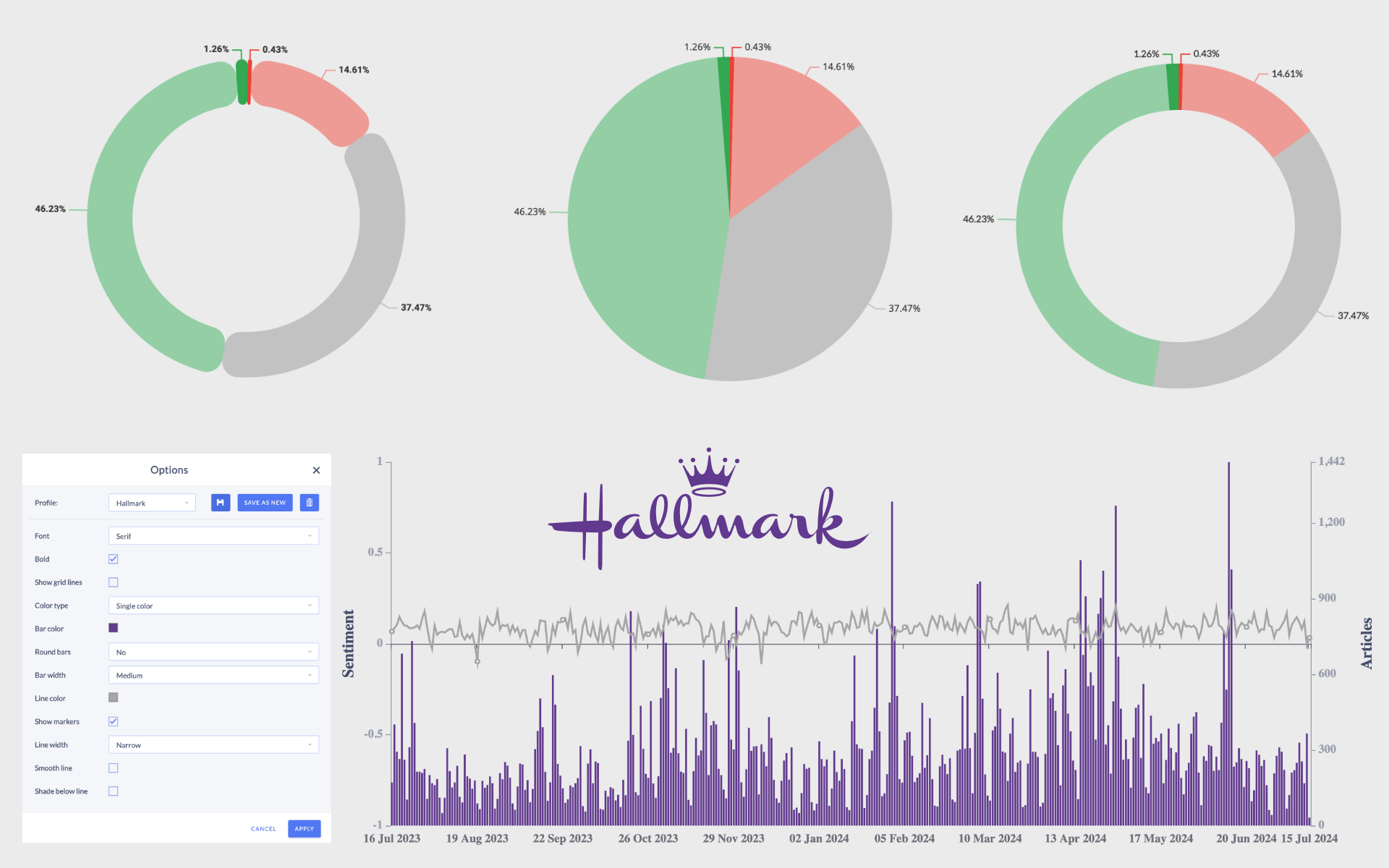
We are thrilled to announce that Event Registry's new Chart Customizations feature is now live! This powerful tool is designed to enhance your data visualization experience by offering extensive customization options. Let's take a closer look at the new features and how they can benefit you.
Discover the Exciting New Features
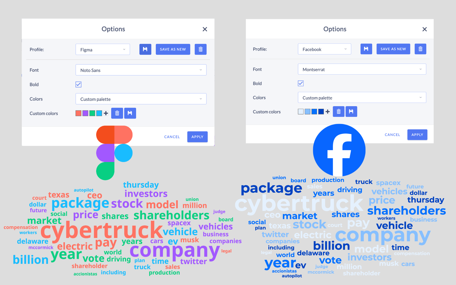
Personalized Profiles:
- Consistency Made Easy: Save your customization settings and apply them across all similar charts effortlessly. Perfect for maintaining your brand's identity.
- Brand Colors: Integrate your company’s brand colors into your charts, ensuring every presentation is on-brand and visually striking.
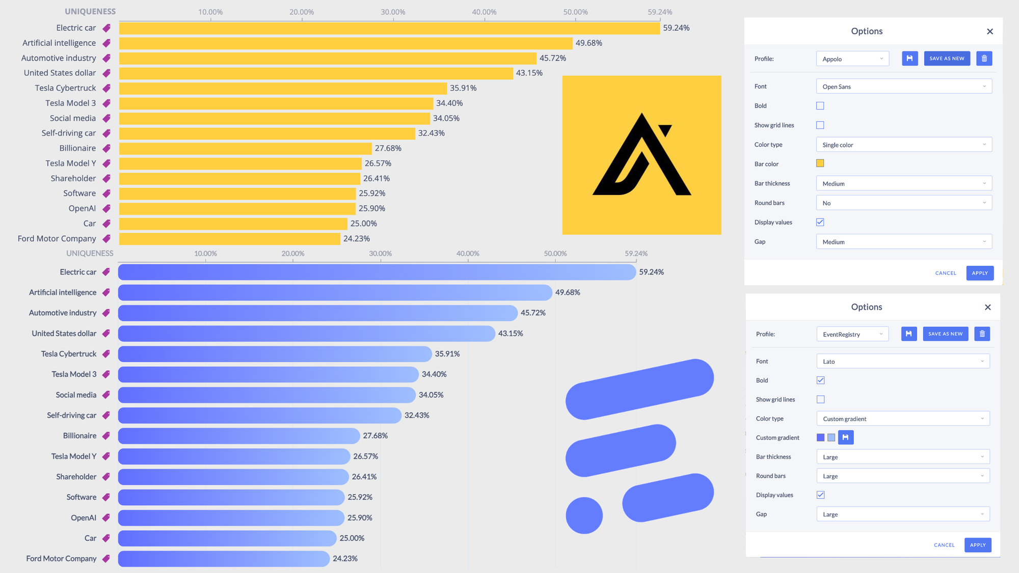
Font and Style Options:
- Tailored Typography: Choose from top fonts like Lato, Work Sans, Monospace, Arial, Serif, Roboto, Open Sans, Montserrat, Oswald, Raleway, and Noto Sans. Customize font styles and boldness to fit your brand’s voice.
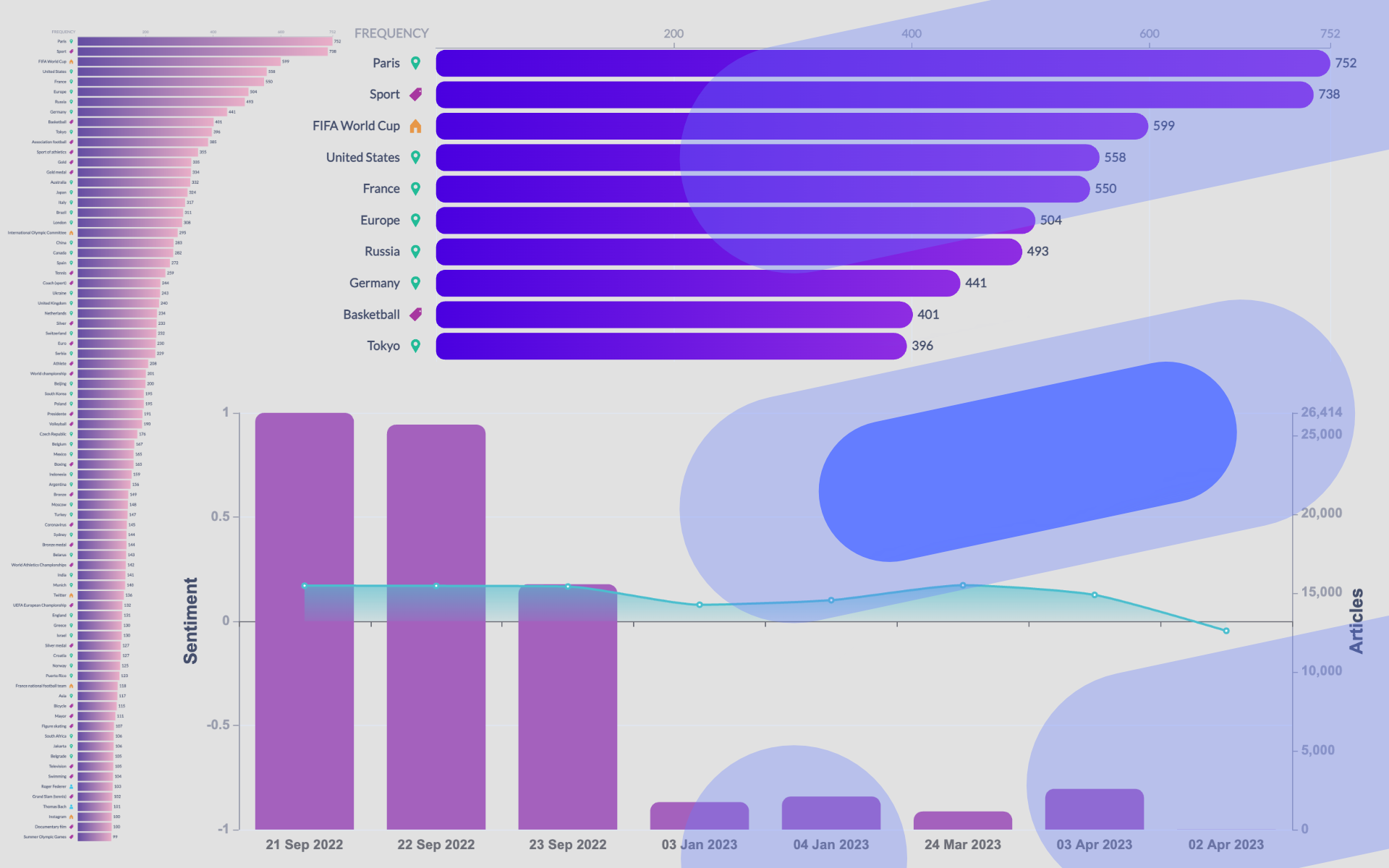
Bar Chart Enhancements:
- Precision Control: Adjust the thickness and roundness of bars, and set gaps between them for a clean, professional look.
- Color Your World: Use the color picker for exact color choices, including gradients and predefined color options to match your brand.
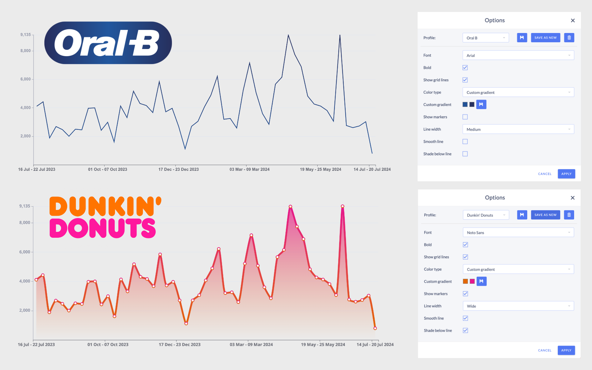
Line Chart Flexibility:
- Marker Magic: Show or hide markers, adjust line width, and choose between peaked or smooth lines.
- Dynamic Display: Fill the area under the line with color to highlight trends and insights.
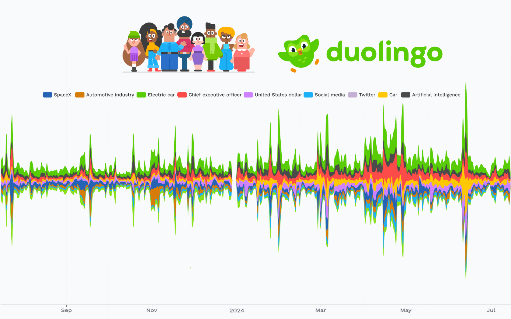
Tag Cloud Customization:
- Engaging Visuals: Choose from various fonts and color palettes, making your tag clouds more exciting and visually appealing.
Sentiment Analysis Visualization:
- Versatile Views: Opt for pie or donut charts, adjusting segment roundness and padding.
- Colorful Insights: For sentiment over time, use bar and line chart functionalities to display data effectively and beautifully.
Concept Graphs and Trends:
- Seamless Customization: Enjoy the same customization options as tag clouds, ensuring a consistent and appealing presentation across all visualizations.
These features are designed to save you time, enhance the visual impact of your presentations, and ensure your data always aligns with your brand.
Dive In and Explore!
Event Registry’s new Chart Customizations feature is a strategic tool that goes beyond aesthetics. It addresses core business needs for branding, efficiency, and user engagement. Don’t miss out—explore these new features and see how they can transform your data presentation and decision-making processes.
Stay ahead of the curve and let your data shine with Event Registry's customizable charts. For more details, check out our blog post: Enhancing Brand Consistency and Efficiency with Customizable Data Visualization.